A system for infinite UI possibilities
2023

Working on the Michelin team, within the Restaurant XP team, we were aiming to give restaurants the possibility to personalize the UI on the customer-facing solutions that we provide them. This came with a first vision of the extent of personalization, elements such as : primary and secondary colors, font, logo.After participating in defining this elements as the design part of a product-tech-design trio, it was my task to define how would these elements live within the solution, what happens when some colors are selected, how do we facility choices that will make sure the interfaces remain accessible according to WC3 contrast compliance standards, how do we create rules that can apply to a huge amount of possibilities. For this I created a guide that allowed engineers to implement the solution, product to keep a track of decisions and the logic behind them, as well as letting it be accessible to all of the product designers, in case anyone’s project would intersect with personalization features.
In order to achieve a minimum of accessibility standards, we took away the possibility of choosing the color of the font at all levels, which avoids having a color of a font over a Background or Button fill color that does not have a good enough contrast.
It calculates the contrast between the chosen color and White (#FFFFFF) and Black (#000000).
The mathematical model for calculating luminance is rather convoluted, but what we need to know is that:
The formula is just the quotient between the brighter color’s luminance (the bigger number) and the dark color’s luminance (the smaller number):
ratio = lum(brighter color) + 0.05 / lum(darker color) + 0.05
The contrast ratio of any two colors ranges between 1(two of the same colors) to 21 (black and white). The WCAG requires a contrast ratio of at least 4.5.
Basically, we calculate whether a white font or black font over the selected color has a bigger contrast, and use that one.
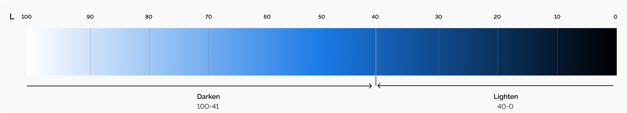
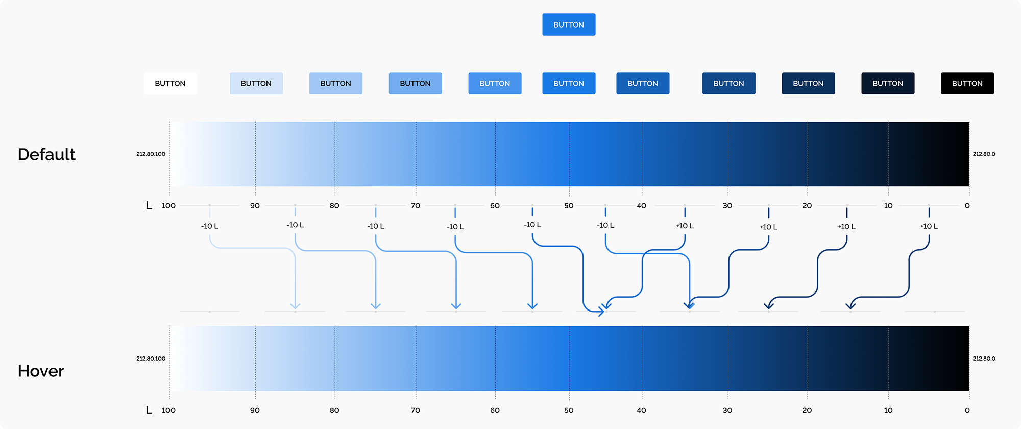
After discussions with Front and Design System team members, the approach that appeared to be more scalable was one where the color was transformed to HSL, and then the color is calculated as a formula where we would reduce Lightness from the base color. A formula that could look something like this:`tf-button-primary-background—state = my-custom-color ±X Luminosity`
After Benchmarking with IBM’s [Carbon] and Shopify’s [Polaris] a bidirectional approach was proposed where colors with 40+ Luminosity get Darkened when hovering or pressing, and those under, get Lightened —this avoids having edges of the spectrum not having an interaction.
The focus state draws attention to the active element on a page when using the keyboard or voice to navigate. The focus of an element is indicated by adding a 2px border around the element. This color corresponds to the color that is calculated for the font. Meaning if we have a dark background, the color will be white; and if we have a light background the border color will be black.


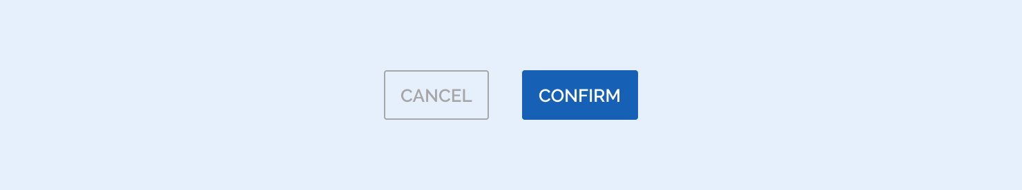
A disabled state is applied to a component when the user is not allowed to interact with the component due to either permissions, dependencies, or pre-requisites. Disabled states completely remove the interactive function of a component and therefore don’t receive hover or focus.
Disabled states are set by changing the button-fill color to background-color with ±15 Luminosity, and setting the text color as background-color.


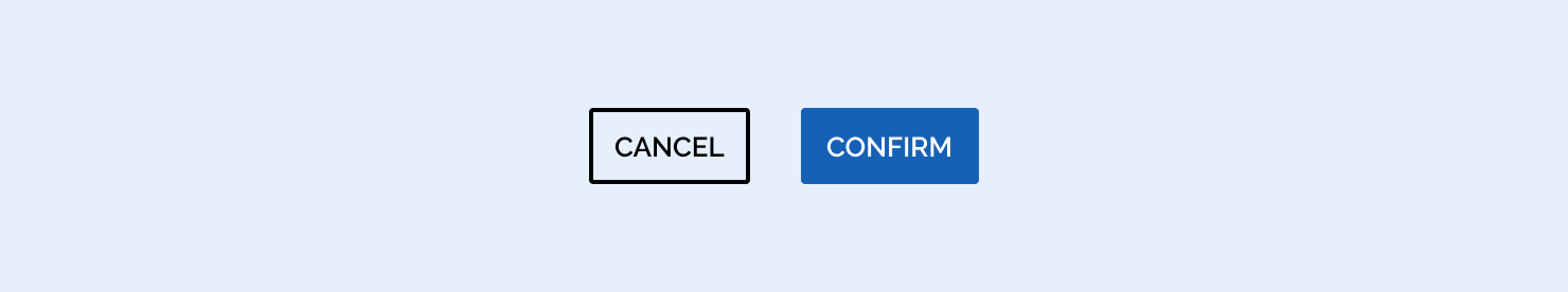
By default, the secondary button inherits it’s style from the background color and the calculated text color. Secondary buttons always take the fill color of the background-color. The text color is calculated as usual, and so will match the overall text color.

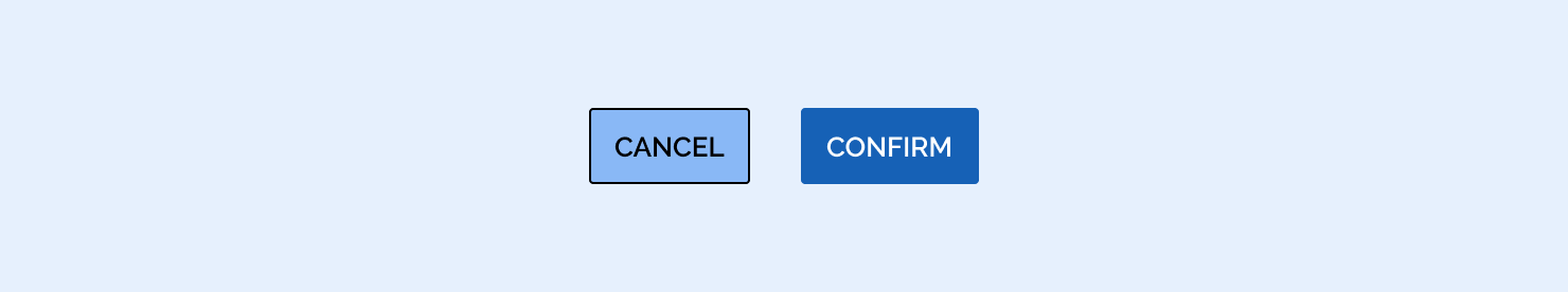
When hovering the Hover principle is the same, just applied to the background-color.
.png)


This state is presented with an outside border stroke from of 2px

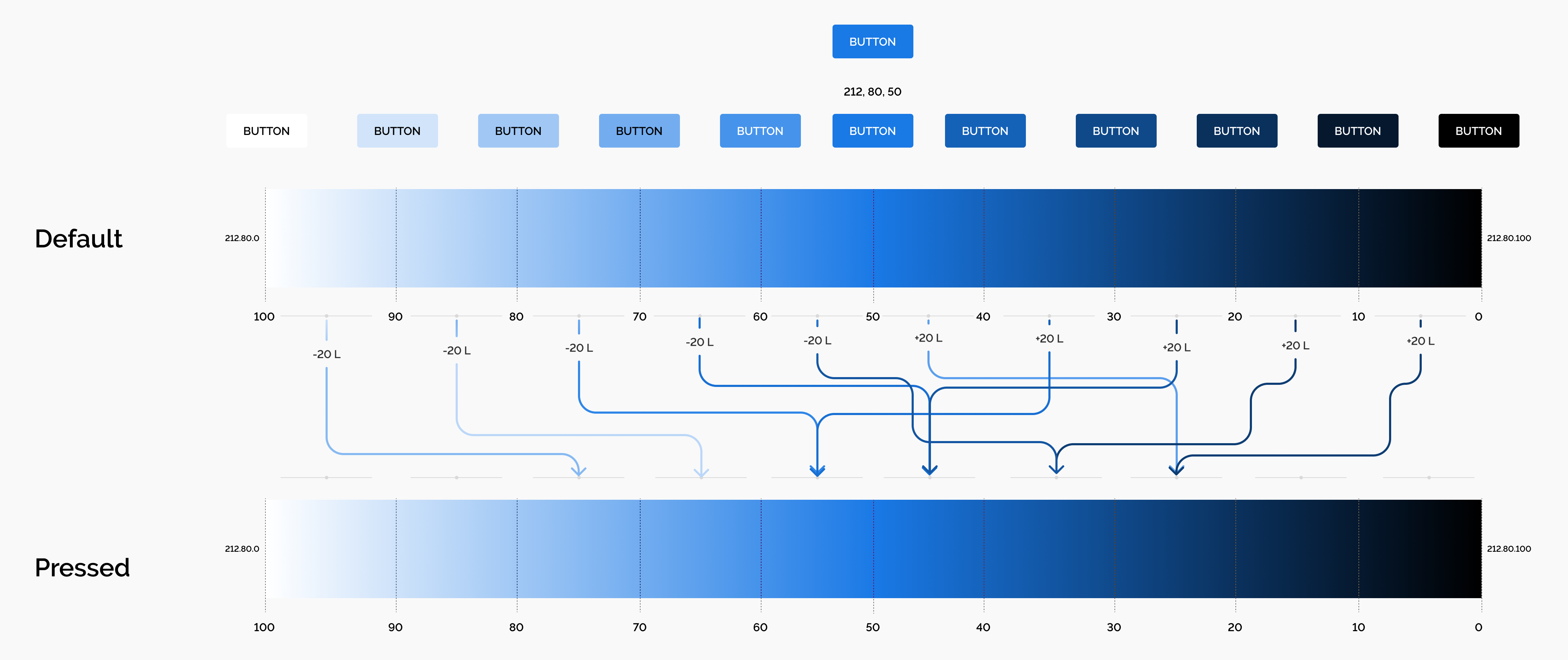
Pressed is done in measures of 20 L, just like hover, direction is defined by amount of Luminosity of the selected color using the background-color.

Disabled states are set departing from the background-color for text and stroke, then setting Saturation to 0, changing Luminosity by ±30.
