Redesigning thefork's booking module experience
2022

This main conversion point for Restaurants was accumulating complaints, bugs and overall a bad experience that left the Restaurant dissatisfied and us with a poor image.
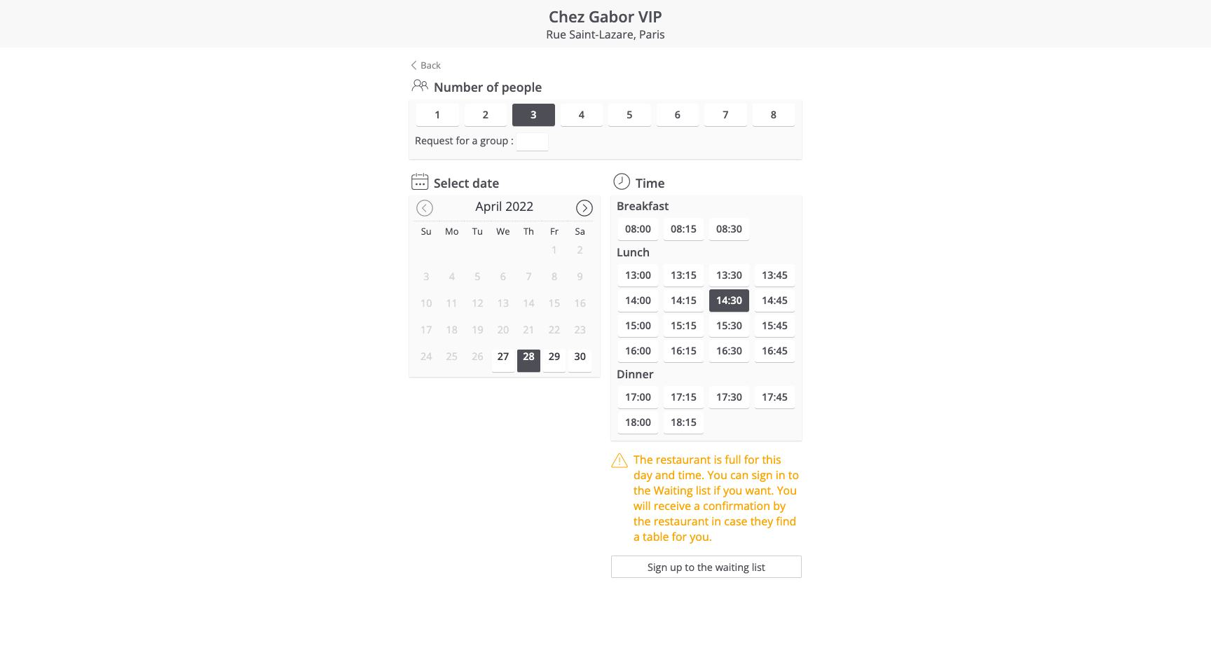
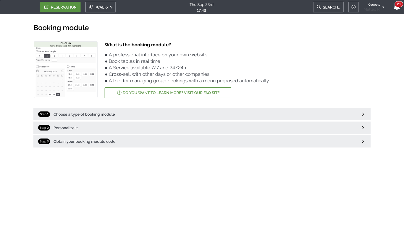
What is the booking module? - A professional interface on your own website - Book tables in real time - A service available 7/7 and 24/24h - Cross-sell with other days or other companies - A tool for managing group bookings with a menu proposed automatically
Top design challenges
Old Booking flow — as seen on Restaurant websites
Old Cconfiguration — within TheFork Manager software
Setup ran in three steps: choose a type of booking module, personalize it, and obtain your booking module code.
I did internal user research to better understand the issues and came up with hypotheses to be confirmed, moving progressively through:
After the research, all the knowledge was captured through glean.ly — at the time, our newly adopted Atomic Research database.
The booking module was a Restaurants' tribe–owned project. But being user-facing, it only made sense that we aligned with our B2C counterparts to have a unified experience for users going through our website or through our customers' websites.
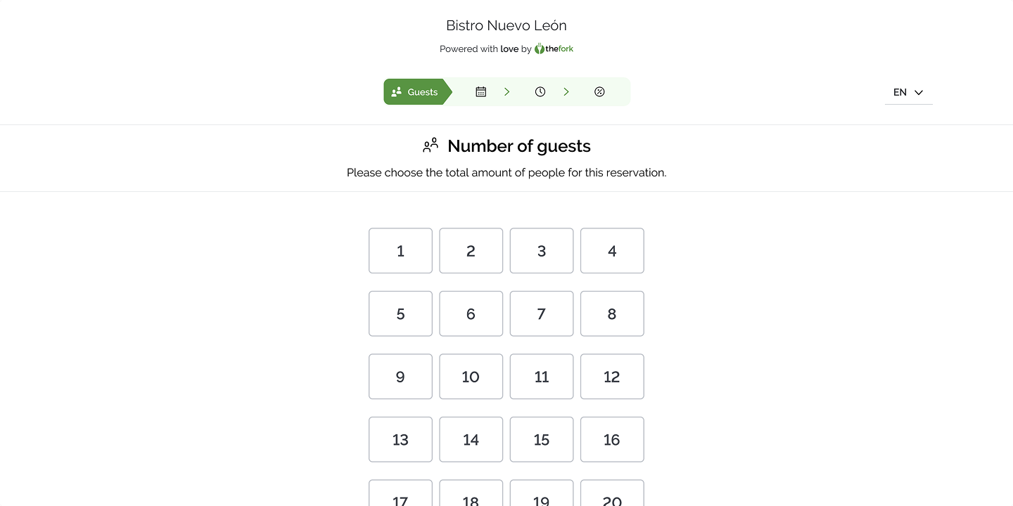
New user flow — as seen on Restaurant pages
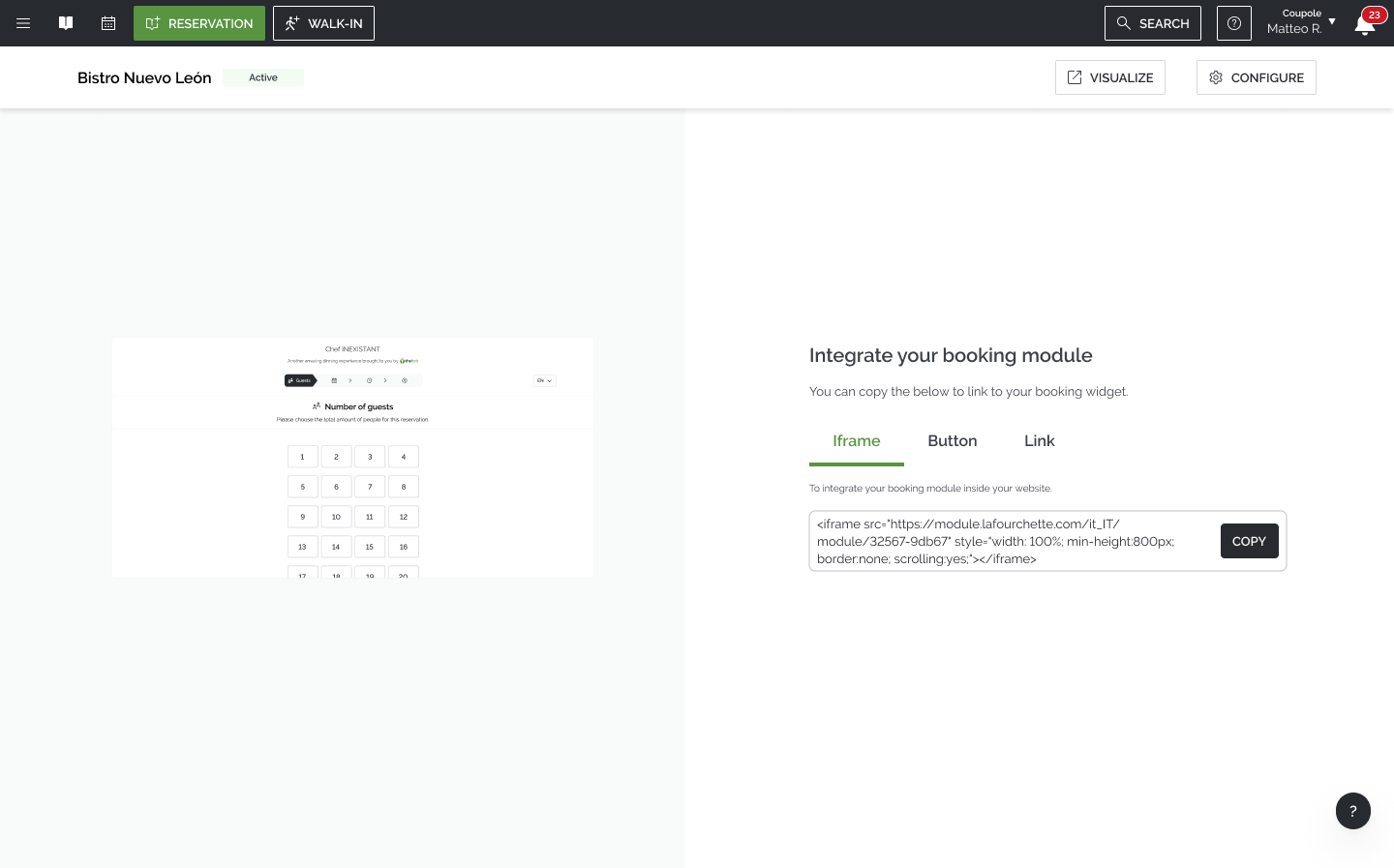
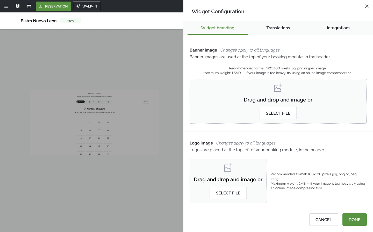
New configuration — within TFM software
Restaurants were pleased and account managers got their workload reduced. But still, we had one small but mighty group of clients that was yet to fully implement our solution.
